
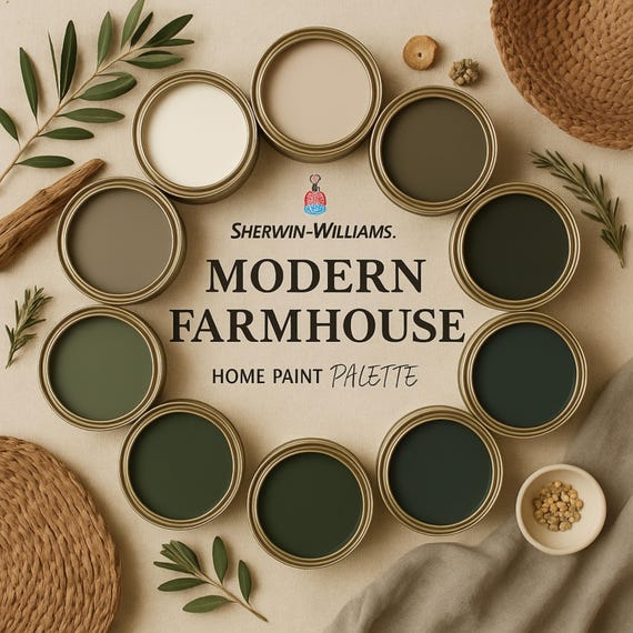
Choose a neutral base, limit accent colors, and balance light and texture for lasting elegance.
I have guided dozens of rooms and brands in selecting palettes that feel modern yet enduring. This article explains how to choose a color palette for timeless elegance with clear steps, proven principles, and real-world advice you can use today. Read on to learn simple rules, tested combinations, and mistakes to avoid so your palette still looks fresh years from now.

Why timeless palettes matter
A timeless palette makes spaces feel calm and confident. It reduces the need for frequent updates.
Good color choices also increase resale appeal and create a clear design story. I rely on basic color theory and visual experience to pick colors that age well.
Core principles of how to choose a color palette for timeless elegance
When you think about how to choose a color palette for timeless elegance, focus on balance and restraint. Keep palettes simple. Use proven rules from color theory and real-world testing.
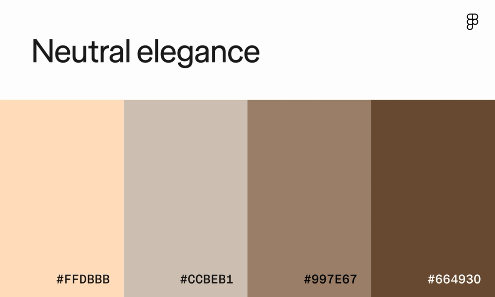
- Start with a neutral base
Neutral walls or major surfaces set a calm stage. Whites, warm beiges, soft greys, and greiges give flexibility. - Limit accent colors
Pick one or two accent tones. Too many accents create visual clutter. - Mind tone and temperature
Warm neutrals feel cozy. Cool neutrals feel crisp. Match the mood you want to create. - Prioritize contrast and proportion
Use light, mid, and dark values. Aim for roughly 60/30/10 distribution: base, secondary, accent. - Use texture and material to add depth
Texture softens simple palettes. Natural wood, stone, and textiles enrich neutral schemes. - Test in real light
Paint chips and swatches look different at various times of day. Always test on-site.

How to choose a color palette for timeless elegance: a step-by-step process
Follow simple steps to build a lasting palette. Each step is quick to test.
- Define the mood you want
Write one sentence about how the room should feel. For example: "calm and refined" or "sunlit and airy." - Choose a neutral base
Pick a wall color or large furniture color first. This decision limits future mistakes. - Select a secondary color
Use this on large accents like curtains, rugs, or upholstery. - Pick one or two accent colors
Add small pops in art, trim, or accessories. Keep saturation low for subtlety. - Check contrast and scale
Ensure textural contrast and value contrast exist. Large rooms can take richer accents. - Test in multiple lights
Observe samples morning and evening. Change if a color reads too warm or too cool. - Commit to materials
Match color choices to wood, metal, and stone finishes. Materials anchor the palette.
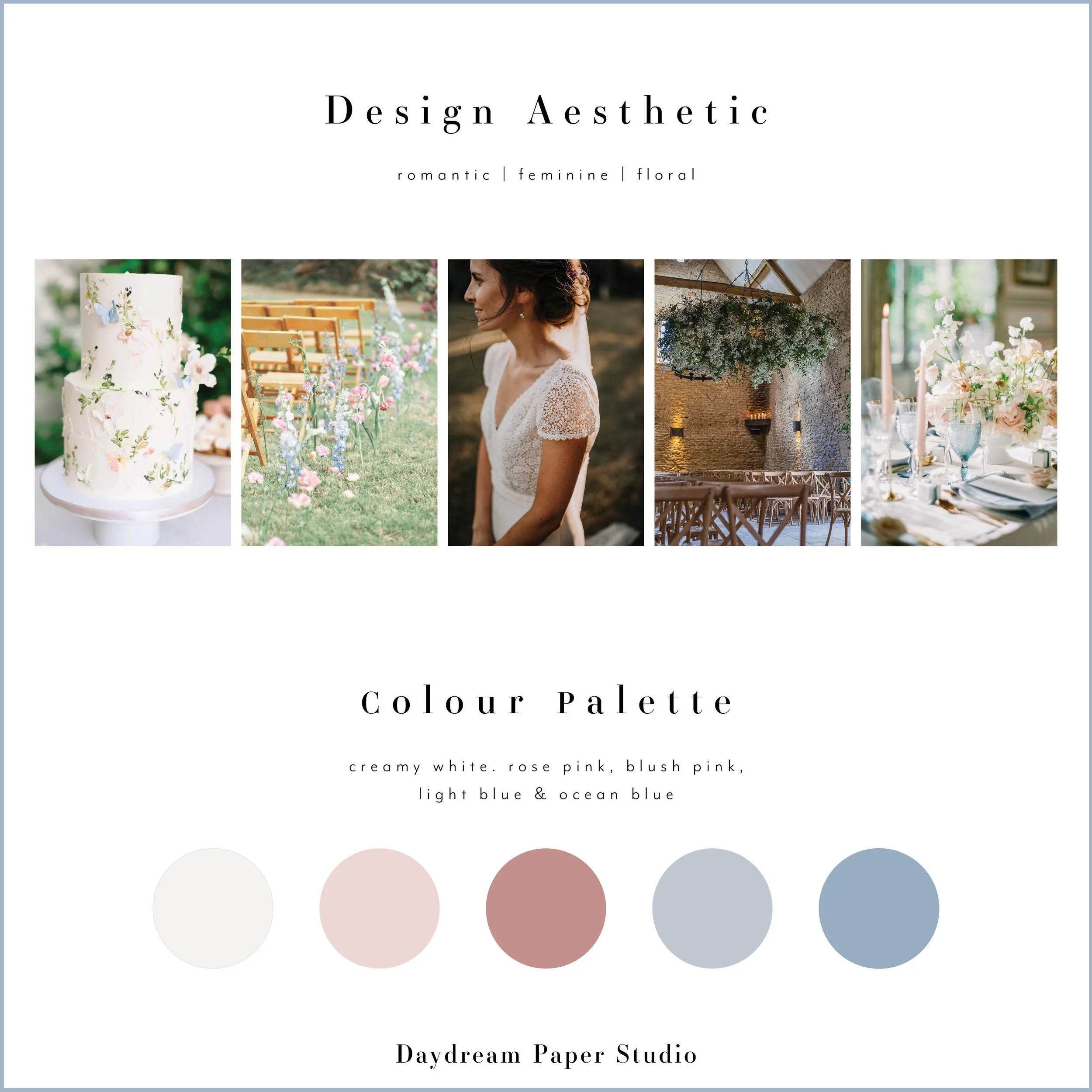
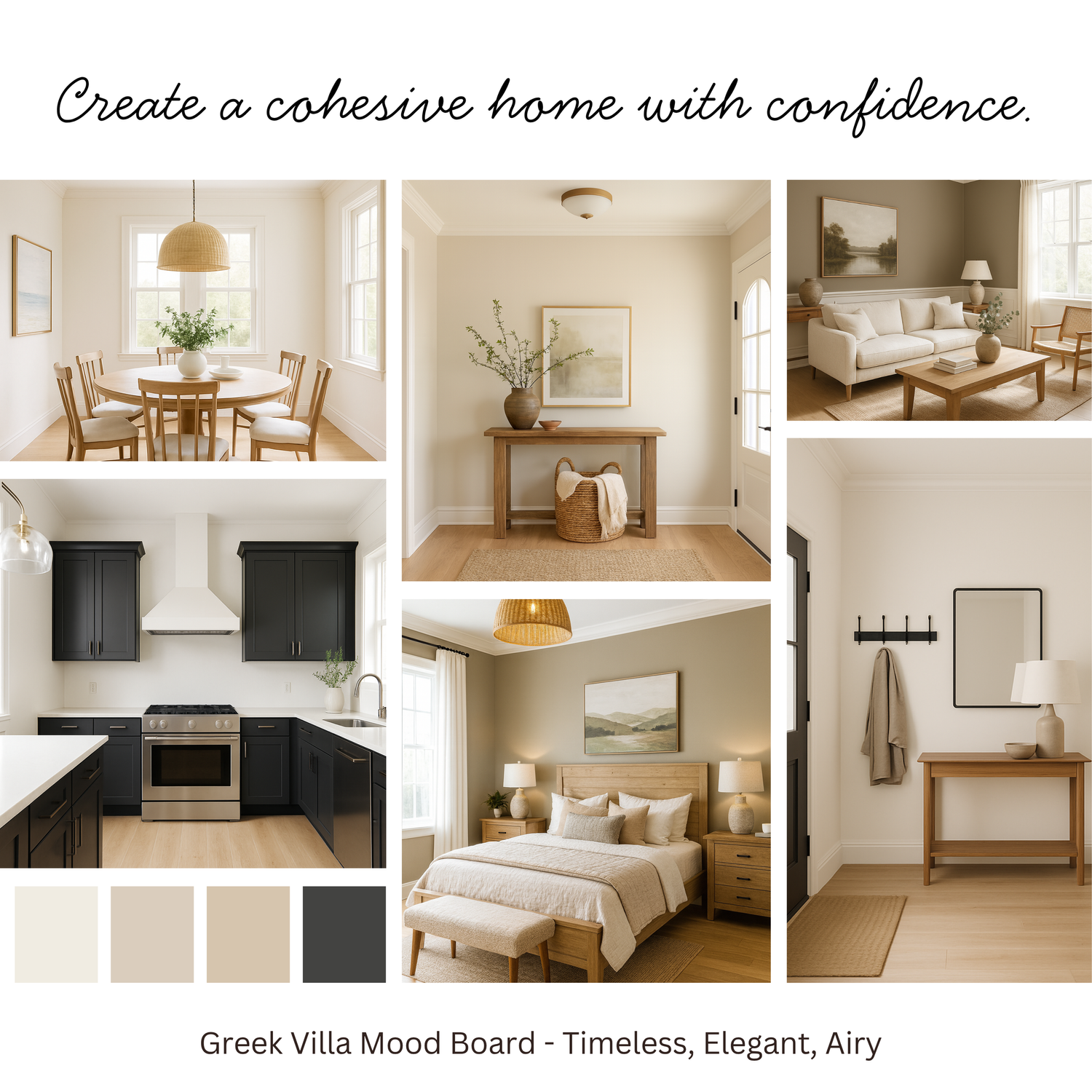
Room-specific examples and palettes
Applying how to choose a color palette for timeless elegance depends on the room and function. Below are practical starting points.
- Living room
Base: Warm off-white. Secondary: Soft grey. Accent: Deep navy. Add a walnut coffee table for warmth. - Kitchen
Base: Clean white or pale greige. Secondary: Dove grey cabinets. Accent: Brushed brass hardware. - Bedroom
Base: Muted warm beige. Secondary: Dusty blue linens. Accent: Charcoal throw pillows. - Bathroom
Base: Pale cool grey. Secondary: White porcelain. Accent: Matte black fixtures for contrast. - Exterior
Base: Soft taupe siding. Secondary: Trim in off-white. Accent: Black front door for a classic look.
Common mistakes when learning how to choose a color palette for timeless elegance
Avoid these pitfalls to keep your palette durable.
- Following every trend
Trends fatigue fast. Favor classic tones over fad colors. - Overloading accents
Too many bold hues break the harmony. Stick to one or two accents. - Ignoring light
Artificial and natural light change colors dramatically. Test broadly. - Matching paint to screen swatches
Screens distort color. Always view physical samples. - Forgetting scale
Small rooms need lighter values. Big rooms can handle deeper tones.
Personal experience and practical tips for how to choose a color palette for timeless elegance
Years of projects taught me quick checks that save time and money. I once specified a warm grey for an open-plan home. On-site the paint read pink at dusk because of nearby brick. We switched to a neutral with cooler undertones and the space settled. The lesson: always test in place and at different times.
Practical tips I use:
- Photograph swatches at noon and blue hour. Compare results.
- Use off-white trims instead of stark white to avoid harsh contrast.
- Keep fabric samples near the largest furniture to ensure harmony.
Quick questions about how to choose a color palette for timeless elegance
What is the easiest way to start a timeless palette?
Begin with a neutral base on major surfaces, then add one secondary and one accent color. This keeps the scheme focused and flexible.
How many colors should a timeless palette include?
Aim for three main values: base, secondary, and accent. Use variations of those colors through texture and pattern.
Can bold colors be part of a timeless palette?
Yes, when used sparingly as accents. Keep saturation low and pair bold hues with calm neutrals.

Frequently Asked Questions of how to choose a color palette for timeless elegance
What paint finish is best for a timeless look?
Matte or eggshell finishes read softer and hide imperfections better than glossy finishes. Use satin for trim where durability is needed.
How do I pick a neutral that won't feel boring?
Choose a neutral with a subtle undertone that complements your light and materials. Test it with flooring and textiles to ensure warmth or coolness works.
Should I match metals and hardware to my palette?
Yes. Metals act like colors. Brushed brass warms a palette, while matte black adds crisp contrast. Coordinate finishes with your accent tone.
How can I make a small space feel timeless?
Use a light neutral base and add low-contrast textures. Keep furniture streamlined and use one accent color in small doses.
When is it okay to update a timeless palette?
Update when your needs or the architecture change. Small accessory swaps refresh a palette while keeping the core color scheme intact.
How long does a timeless palette typically last?
A well-chosen palette can feel relevant for 5–15 years depending on trends and personal taste. Neutral bases and restrained accents help longevity.
Conclusion
Choosing a palette is a mix of rules and intuition. Start with a neutral base, limit accents, test in real light, and use texture to add depth. Apply the step-by-step method above and you will know how to choose a color palette for timeless elegance that endures. Try a small room first, take photos in different light, and tweak until it feels right. Share your results or questions below and subscribe for more design guides.

Daniel Hart is a consumer product analyst who specializes in mattress technology, smart bedding, and home comfort innovation. Before joining Royal Comport, Daniel worked with several e-commerce research teams, testing and comparing sleep products for quality, value, and long-term performance. He brings data-driven insight and real-world testing to every review he writes.
